
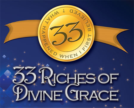
 We're getting ready to order this card for the church to list the message topics for an upcoming year-long series. I'm rather happy with the result of it! The title of the series as "33 Riches of Divine Grace", so I went with the sparkly gold and royal blue theme.
The blue background layer is a free design that I found online. The white is a filled layer with a pattern effect applied in order to give it a crackly, textured look.
The coin and banner were formed in Photoshop. The sparkles around the title were hand drawn using a star-shaped paintbrush (at varying sizes) as well as a glow layer effect.
The title text is a combination of Copperplate Gothic Light and Harrington, which made for an elegant, yet fun design for the letters. I love how the "G" in Grace and the "E" in Riches are touching. Sometimes you couldn't plan as well the things that happen by accident.


No comments:
Post a Comment