
Over at iHeartFaces.com, they have a weekly event during which they take a "not-so-good" photo and give it to their contributors to "fix" in whatever photo editor they wish to use. There's no prize, but it's something fun for design geeks like me to do on a Friday afternoon.
To the right is the image they provided for Fix-It-Friday, Week #6.
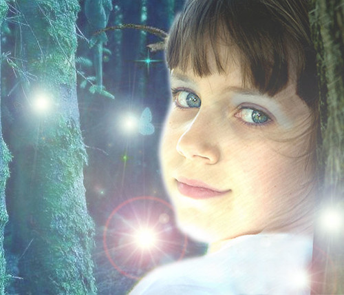
Below is how I edited it to my own liking.

I really love the way this one turned out. Her face and expression lend themselves to the new fantasy setting.
I used Photoshop and many fun filters to get the sketchy appearance. Masks and high-transparency layers were used. Background is a part of an image I found on the web.
The "fairies" were created using various levels and types of lens flares.
Please comment and let me know what you think!
There are a lot more images to check out from other contributors, so click on that link if you'd like to see them too.


That is so awesome, Mangy! :D I love it!
ReplyDeleteWOW - this FIF is really bringing out the creative streak in some people!! Love it - very different & I agree - it really works.:D
ReplyDelete(Frogmum)
Miruial: Thanks! It was fun to do!
ReplyDeleteCaroline: Thank you! I'm glad to hear that there are other creative entries. I'll have to check them out for sure. It's good to see a wide variety of takes on the same image rather than everyone doing the same as the examples.
This is so fun and unique. I really enjoyed it!
ReplyDeleteThis just goes to show the endless possibilities with photo editing. I just read in Scott Kelby's book how to turn a solemn face into a smile. Then I came here and saw that you did that. This one definitely nailed it on creativity!
ReplyDeleteWow! This is awesome.
ReplyDeleteVery nice edit. I like all the texture. It looks like the cover of a book!
ReplyDeleteWhat a unique approach to FIF. Love the creativity you put into. Nice work.
ReplyDeletevery cute.
ReplyDeleteCarebear, AVA, Shae: Thanks!
ReplyDeleteDrew: Thank you! Yes, she definitely needed a bit of a smile for this setting. Photo editing rules.
Katelyn: Thanks! I didn't think of it as a book cover before, but you're right! A title would fit very nicely there on the left.
Awdrey: Thank you! Yes, I like to push the "fixing" to a place that imagination wants to go. So many entries end up looking the same--it's nice when there are some variants.
Finally commenting on this:
ReplyDeleteThis is absolutely beautiful. I'll admit that I'm looking at it and reconstructing it in my mind to figure out exactly how I would get the same effect. :-P
Elraen, hey, it's okay to admit that. ;o) One of the tricks I used was that I created a separate, duplicate layer of the face, THEN applied the Artistic/Colored Pencil filter. I masked the too-bright areas, then lowered the transparency so that it lays gently over the original image. This way, the colors stay bright.
ReplyDeleteI wish I could give you a step-by-step, but I just keep playing with images like this until I get it to do what I want. I can remember that I used a LOT of lighting effects on various parts of the image though.